Outlier Detection with UCI Wines

The wine quality dataset is a classic machine learning dataset available on the UCI data archive. In this post, I’ll test a few approaches for outlier detection using the white vinho verde wine samples. These were provided by the Viticulture Commission of the Vinho Verde Region in Portugal in 2009.
Data Exploration
First let’s take a look at the structure of the data. There are 12 variables: 11 of these provide the results of physicochemical tests, while the quality field provides a rating for the wine. If we were to create a classification model using this data, quality would be our response variable.
## 'data.frame':    4898 obs. of  12 variables:
##  $ fixed.acidity       : num  7 6.3 8.1 7.2 7.2 8.1 6.2 7 6.3 8.1 ...
##  $ volatile.acidity    : num  0.27 0.3 0.28 0.23 0.23 0.28 0.32 0.27 0.3 0.22 ...
##  $ citric.acid         : num  0.36 0.34 0.4 0.32 0.32 0.4 0.16 0.36 0.34 0.43 ...
##  $ residual.sugar      : num  20.7 1.6 6.9 8.5 8.5 6.9 7 20.7 1.6 1.5 ...
##  $ chlorides           : num  0.045 0.049 0.05 0.058 0.058 0.05 0.045 0.045 0.049 0.044 ...
##  $ free.sulfur.dioxide : num  45 14 30 47 47 30 30 45 14 28 ...
##  $ total.sulfur.dioxide: num  170 132 97 186 186 97 136 170 132 129 ...
##  $ density             : num  1.001 0.994 0.995 0.996 0.996 ...
##  $ pH                  : num  3 3.3 3.26 3.19 3.19 3.26 3.18 3 3.3 3.22 ...
##  $ sulphates           : num  0.45 0.49 0.44 0.4 0.4 0.44 0.47 0.45 0.49 0.45 ...
##  $ alcohol             : num  8.8 9.5 10.1 9.9 9.9 10.1 9.6 8.8 9.5 11 ...
##  $ quality             : Factor w/ 7 levels "3","4","5","6",..: 4 4 4 4 4 4 4 4 4 4 ...
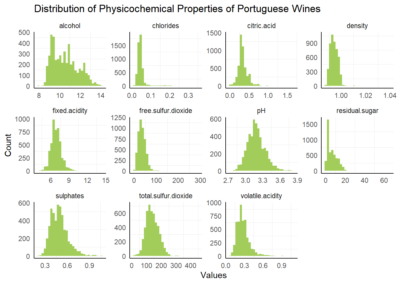
The structure of the dataset provides the number of rows and columns as well as the datatypes that are found in the wines dataset. To get a better picture of the shape of the individual variables, let’s plot them in histograms:
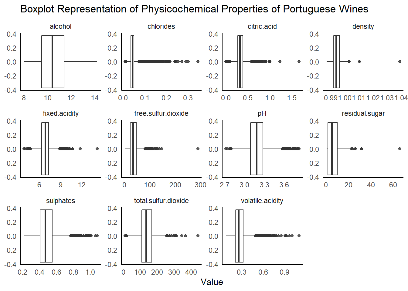
 The histogram plot gives us an idea of the shape of each variable: most of the variables appear to be skewed and not normally distributed. In several of the plots, there appear to be potential outliers. To get a better look at these points, we can use a boxplot.
Outlier Detection with IQR
The boxplot is another way to look at the distribution of a variable, focusing on five summary statistics: the median (the center line), the 25th and 75th percentiles (the hinges), and the range from the hinges to the point nearest 1.5 * inter-quartile range (the whiskers). We’re interested in points that lie beyond the whiskers, which may be potential outliers.

It looks like there are quite a few potential outliers in this data in several fields. Let’s take a look at the most extreme point in the residual sugar column, with a value of 65.80 g/L. I’m not an expert in the chemical attributes in wine, so I used this online resource as a reference for this variable:

Residual Sugar in Wines from Wine Folly
Based on this graphic, most of the wines in this dataset fall in the bone dry - dry categories. The highest data point in this set may be a moscato or riesling in the sweet wines category. While this point wouldn’t be considered extreme in a more diverse set of wines, it is likely an outlier for this specific set of dry Portuguese wines.
For the next set of outlier detection methods, we’ll focus on the relationship between two variables: pH and alcohol.

Distance Based Outlier Detection
Sometimes we may want to look for outliers among several features in a dataset. To do so, we’ll look at two methods: distance based and density based detection. For distance based detection, the k-nearest neighbor (kNN) distance score provides a measure of how isolated a point is from nearby points. In this measure, larger values are more likely to indicate an anomaly. In order to apply this method, data should first be scaled to avoid sensitivity to the scales of individual variables.
# Calculate the 5 nearest neighbors distance matrix
wine_nn <- get.knn(scale(wines), k = 5)

# Create score by averaging distances
wine_nnd <- rowMeans(wine_nn$nn.dist)

# Append the kNN distance score to the wines dataset
wines$score <- wine_nnd
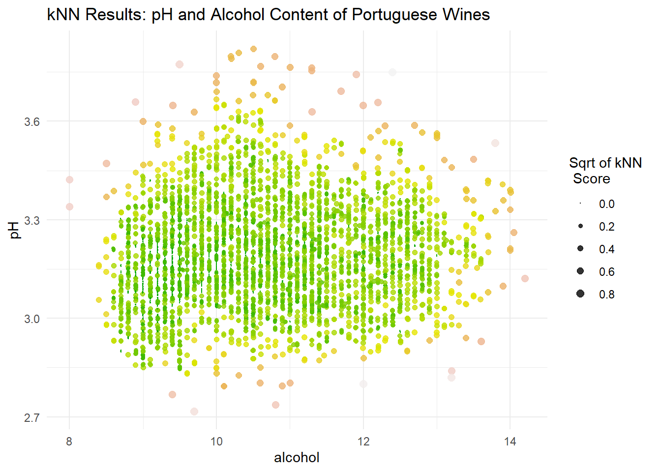
A scatterplot allows us to visualize the results of the kNN algorithm. Points that are larger carry a higher kNN score and are more likely anomalies.
 The kNN results signal points that are far from their nearest neighbors, often global anomalies. However, this doesn’t capture points that are local anomalies.
Density Based Outlier Detection
The Local Outlier Factor (LOF) of a point is the average density around the k nearest neighbors of the point divided by the density around the point itself. This means a high LOF score (greater than one) indicates nearby points are more densely packed than the point of interest, indicating a potential local outlier.
In the code below, the lof() function from the dbscan package is used to calculated the LOF for each point in the dataset.
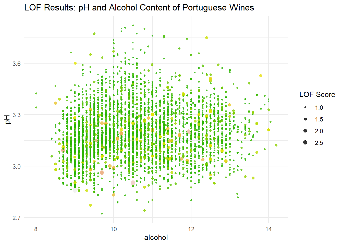
Similar to the kNN results, we can plot the LOF scores in a scatterplot to visualize local outliers.

This plot paints a very different picture of what points we may want to consider as outliers. In practice, we would probably want to explore anomalous points indicated by both of these methods.
In this post, I explored several methods for outlier detection. For univariate data, I used visual inspection of distributions and the IQR to look into extreme points. For bivariate data, I used both a distance approach (kNN) and a density approach (LOF) to uncover extreme behavior in the dataset.